
css的background-clip:text神奇用法
说起 background-clip ,可能很多人都很陌生。Clip 的意思为修剪,那么从字面意思上理解,background-clip 的意思即是背景裁剪。
我曾经在 从条纹边框的实现谈盒子模型 一文中谈到了这个属性,感兴趣的可以回头看看。
简单而言,background-clip 的作用就是设置元素的背景(背景图片或颜色)的填充规则。
与 box-sizing 的取值非常类似,通常而言,它有 3 个取值:
{
    background-clip: border-box;  // 背景延伸到边框外沿(但是在边框之下)
    background-clip: padding-box; // 边框下面没有背景,即背景延伸到内边距外沿。
    background-clip: content-box; // 背景裁剪到内容区 (content-box) 外沿。
}
不过这些都不是本文的主角。本文的主角是 background-clip: text; ,当然现在只有 chrome 支持,所以通常想使用它,需要 -webkit-background-clip:text;。
何为 -webkit-background-clip:text
使用了这个属性的意思是,以区块内的文字作为裁剪区域向外裁剪,文字的背景即为区块的背景,文字之外的区域都将被裁剪掉。
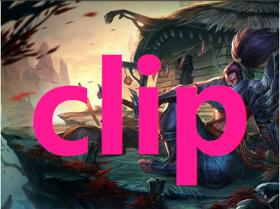
看个最简单的 Demo ,没有使用 -webkit-background-clip:text :
不过这些都不是本文的主角。本文的主角是 background-clip: text; ,当然现在只有 chrome 支持,所以通常想使用它,需要 -webkit-background-clip:text;。
何为 -webkit-background-clip:text
使用了这个属性的意思是,以区块内的文字作为裁剪区域向外裁剪,文字的背景即为区块的背景,文字之外的区域都将被裁剪掉。
看个最简单的 Demo ,没有使用 -webkit-background-clip:text :
div {
  margin: auto;
  width: 400px;
  height: 300px;
  line-height: 300px;
  text-align: center;
  font-size: 180px;
  font-weight: bold;
  color: deeppink;
  background: url("https://timgsa.baidu.com/timg?image&quality=80&size=b9999_10000&sec=1493353832&di=c063b6b9c89082e96ffee0766112ffec&imgtype=jpg&er=1&src=http%3A%2F%2Fpic2016.5442.com%3A82%2F2016%2F0111%2F07%2F3.jpg%21960.jpg") no-repeat center center;
  background-size: cover;
}
效果如下:
使用 -webkit-background-clip:text
我们稍微改造下上面的代码,添加 -webkit-background-clip:text:
div {
  margin: auto;
  width: 400px;
  height: 300px;
  line-height: 300px;
  text-align: center;
  font-size: 180px;
  font-weight: bold;
  color: deeppink;
  background: url(https://timgsa.baidu.com/timg?image&quality=80&size=b9999_10000&sec=1493353832&di=c063b6b9c89082e96ffee0766112ffec&imgtype=jpg&er=1&src=http%3A%2F%2Fpic2016.5442.com%3A82%2F2016%2F0111%2F07%2F3.jpg%21960.jpg) no-repeat center center;
  background-size: cover;
  -webkit-background-clip: text;
}
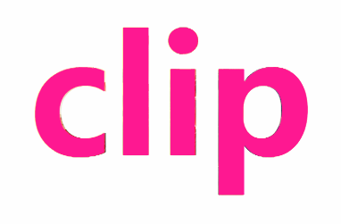
看到这里,可能有人就纳闷了,

啥玩意呢,这不就是文字设置 color 属性嘛。
将文字设为透明 color: transparent
别急!当然还有更有意思的,上面由于文字设置了颜色,挡住了 div 块的背景,如果将文字设置为透明呢?文字是可以设置为透明的 color: transparent 。
div {
  color: transparent;
  -webkit-background-clip: text;
}
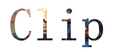
通过将文字设置为透明,原本 div 的背景就显现出来了,而文字以为的区域全部被裁剪了,这就是 -webkit-background-clip:text 的作用。
各类效果制作
了解了最基本的用法,接下来可以想想如何去运用这个元素制作一些效果。
- 大大增强了文字的颜色填充选择
- 文字颜色的动画效果
- 配合其他元素,实现一些其他巧妙的用法
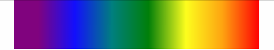
实现文字渐变效果
利用这个属性,我们可以十分便捷的实现文字的渐变色效果。
div {
    margin: 50px auto;
    font-size: 54px;
    font-weight: bold;
    text-align: center;
    text-transform:uppercase;
    color: transparent;
    background: linear-gradient(0, #009688 0%, yellowgreen 100%);
    // background: url('https://unsplash.it/1200/400?image=1067') no-repeat;
    background-size: cover;
    background-position: center center;
    -webkit-background-clip: text;
}

背景渐变动画 && 文字裁剪
因为有用到 background 属性,回忆一下,我在上一篇 巧妙地制作背景色渐变动画! 利用了渐变 + animation 巧妙的实现了一些背景的渐变动画。可以很好的和本文的知识结合起来。
结合渐变动画,当然不一定需要过渡动画,这里我使用的是逐帧动画。配合 -webkit-background-clip:text,实现了一种,嗯,很红灯区的感觉。
.text {
  margin: 0 auto;
  width: 500px;
  line-height: 100px;
  font-family: 'Arial', sans-serif;
  text-align: center;
  z-index: 1;
  font-size: 80px;
  font-weight: bold;
  background: linear-gradient(90deg, red 0, orange 15%, yellow 30%, green 45%, teal 60%, blue 75%, purple 90% ,purple 100%);
  -webkit-background-clip: text;
  color: transparent;
  animation: changeColor .5s linear infinite alternate;
}

@keyframes changeColor {
  0% {
  background: linear-gradient(90deg, red 0, orange 15%, yellow 30%, green 45%, teal 60%, blue 75%, purple 90% ,purple 100%);
  -webkit-background-clip: text;
 }
50% {
  background: linear-gradient(90deg, deeppink 0, yellowgreen 15%, fuchsia 30%, lime 45%, olive 60%, aqua 75%, coral 90% ,brown 100%);
  -webkit-background-clip: text;
 }
100% {
  background: linear-gradient(-90deg, red 0, orange 15%, yellow 30%, green 45%, teal 60%, blue 75%, purple 90% ,purple 100%);
  -webkit-background-clip: text;
 }
}
图片窥探效果
再演示其中一个用法,利用两个 div 层一起使用,设置相同的背景图片,父 div 层设置图片模糊,其中子 div 设置 -webkit-background-clip:text,然后利用 animation 移动子 div ,去窥探图片。
div {
    position: relative;
    margin: 0 auto;
    width: 960px;
    height: 600px;
}

.mask {
    width: 100%;
    height: 100%;
    background: url("https://timgsa.baidu.com/timg?image&quality=80&size=b9999_10000&sec=1493353832&di=c063b6b9c89082e96ffee0766112ffec&imgtype=jpg&er=1&src=http%3A%2F%2Fpic2016.5442.com%3A82%2F2016%2F0111%2F07%2F3.jpg%21960.jpg") no-repeat center center;
    background-size: cover;
    filter: blur(10px);
    transition: .3s;
}

p {
    position: absolute;
    top: 0%;
    left: 0;
    width: 100%;
    height: 100%;
    text-align: center;
    z-index: 1;
    font-size: 180px;
    font-weight: bold;
    background: url($img) no-repeat center center;
    background-size: cover;
    text-shaodw: 2px 2px 2px 2px #fff;
    -webkit-background-clip: text;
    color: transparent;
    animation: move 4s ease-in infinite alternate;
}

@keyframes move {
    0% {
        line-height: 100px;
        font-size: 100px;
    }
    100% {
        line-height: 600px;
        font-size: 1500px;
    }
}
其实还有很多有趣的用法,只要敢想并动手实践,会发现 CSS 真的乐趣挺多的。
当然很多人会吐槽这个属性的兼容性,确实,我个人觉得前端现在的生态有一点面向未来编程的感觉(调戏)。不过提前掌握总体而言利大于弊,多多拓宽自己的视野。