
表单输入框焦点高光css代码
随着HTML 5 + CSS 3的普及,我们使用CSS代码实现的页面效果越来越华丽,而表单输入框获得焦点时的高光效果更是许多HTML 5站点所必备的表单必杀技。尤其是Twitter公司推出Bootstrap框架以后,表单高光效果几乎成为Bootstraper们的必需品。
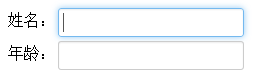
现在,我们就编写如下css代码模仿Bootstrap的表单焦点高光效果。
input, textarea {
 box-shadow: inset 0 1px 1px rgba(0, 0, 0, 0.075);
 transition: border linear 0.2s, box-shadow linear 0.2s;
}

input, textarea, select {
 font-size: 1em;
 display: inline-block;
 padding: 4px;
 color: #555555;
 vertical-align: middle;
 background-color: #ffffff;
 border: 1px solid #cccccc;
 border-radius: 3px;
 margin: 3px 0;
}

/* 获得焦点时的输入框高光效果 */
input:focus,
textarea:focus {
 border-color: rgba(82, 168, 236, 0.8);
 outline: 0;
 outline: thin dotted \9; /* IE6-9 */
 box-shadow: inset 0 1px 1px rgba(0, 0, 0, 0.075), 0 0 8px rgba(82, 168, 236, 0.6);
}

/* 避免对其他元素的不良影响(主要表现在IE浏览器中) */
input[type="file"]:focus,
input[type="radio"]:focus,
input[type="checkbox"]:focus,
select:focus {
 outline: thin dotted #333;
 outline: 5px auto -webkit-focus-ring-color;
 outline-offset: -2px;
 box-shadow: none;
}

input[type="image"],
input[type="checkbox"],
input[type="radio"] {
 padding: 0;
 margin: 3px 0;
 *margin-top: 0; /* IE7 */
 line-height: normal;
 cursor: pointer;
 background-color: transparent;
 border: 0 \9; /* IE9- */
 border-radius: 0;
}

/* 避免对按钮样式的不良影响 */
input[type="button"],
input[type="submit"],
.btn {
 display: inline-block;
 *display: inline;
 padding: 4px 10px;
 font-size: 1em;
 color: #333333;
 text-align: center;
 text-shadow: 0 1px 1px rgba(255, 255, 255, 0.75);
 cursor: pointer;
 background-color: #f5f5f5;
 *background-color: #e6e6e6;
 background-image: -webkit-gradient(linear, 0 0, 0 100%, from(#ffffff), to(#e6e6e6));
 background-image: linear-gradient(top, #ffffff, #e6e6e6);
 background-repeat: repeat-x;
 border: 1px solid #cccccc;
 *border: 0;
 border-color: rgba(0, 0, 0, 0.1) rgba(0, 0, 0, 0.1) rgba(0, 0, 0, 0.25);
 border-color: #e6e6e6 #e6e6e6 #bfbfbf;
 border-bottom-color: #b3b3b3;
 border-radius: 4px;
 filter: progid:dximagetransform.microsoft.gradient(startColorstr='#ffffff', endColorstr='#e6e6e6', GradientType=0);
 filter: progid:dximagetransform.microsoft.gradient(enabled=false);
 *zoom: 1;
 box-shadow: inset 0 1px 0 rgba(255, 255, 255, 0.2), 0 1px 2px rgba(0, 0, 0, 0.05);
}