美化CSS3有序列表
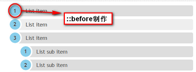
使用效果:css美化有序列表
技巧
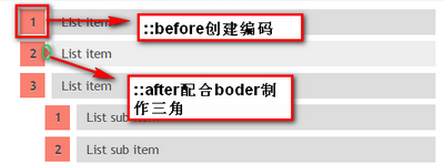
list-style:none:禁用列表的默认编码counter-reset和counter-increment:创建一个计数范围和增加计数。CSS 2.1对这两个属性有过详细的介绍。content:在content中插入创建编码的索引号。::beforeCSS3的伪元素的运用,添加“content”中插入的内容。
html部分:
HTML就不复杂,和我们平时写“ol”列表一样的,这里两个DEMO分别定义了一个类名“rounded-list1”和“rectangle-list”
<ol class="rounded-list1">
 <li><a href="">List item</a></li>
 <li><a href="">List item</a></li>
 <li><a href="">List item</a>
 <ol>
 <li><a href="">List sub item</a></li>
 <li><a href="">List sub item</a></li>
 <li><a href="">List sub item</a></li>
 </ol>
 </li>
 <li><a href="">List item</a></li>
 <li><a href="">List item</a></li>
 </ol>
<ol class="rectangle-list">
 <li><a href="">List item</a></li>
 <li><a href="">List item</a></li>
 <li><a href="">List item</a>
 <ol>
 <li><a href="">List sub item</a></li>
 <li><a href="">List sub item</a></li>
 <li><a href="">List sub item</a></li>
 </ol>
 </li>
 <li><a href="">List item</a></li>
 <li><a href="">List item</a></li>
 </ol>
css部分
这种技术使用了自动计数和编码。基本上他是使用了CSS2中的两个属性中:“counter-reset”(自动计数)和“counter-increment”(增数),正如你下面看到的代码一样,“counter-increment”将配合CSS3的伪元素“::before”或“::after”中的“content”创建编码。
1、列表基本样式
ol{
 counter-reset: li; /* 创建一个计数器 */
 list-style: none; /* 清除列表默认的编码*/
 *list-style: decimal; /* 让IE6/7具有默认的编码 */
 font: 15px 'trebuchet MS', 'lucida sans';
 padding: 0;
 margin-bottom: 4em;
 text-shadow: 0 1px 0 rgba(255,255,255,.5);
 }

 ol ol{
 margin: 0 0 0 2em; /* 给二级列表增加一定的左边距*/
 }
2、Rounded-shaped编号
/*rounded shaped numbers*/
 .rounded-list1 a {
 position: relative;
 display: block;
 padding: 0.4em 0.4em 0.4em 2em;
 *padding: 0.4em;/*for ie6/7*/
 margin: 0.5em 0;
 background: #ddd;
 color: #444;
 text-decoration: none;
 /*CSS3属性*/
 border-radius: 0.3em;/*制作圆角*/
 /* transition动画效果*/
 -moz-transition: all 0.3s ease-out;
 -webkit-transition: all 0.3s ease-out;
 -o-transition: all 0.3s ease-out;
 -ms-transition: all 0.3s ease-out;
 transition: all 0.3s ease-out;
 }
 .rounded-list1 a:hover {
 background: #eee;
 }
 .rounded-list1 a:hover::before {
 /*悬停时旋转编码*/
 -moz-transform: rotate(360deg);
 -webkit-transform: rotate(360deg);
 -o-transform: rotate(360deg);
 -ms-transform: rotate(360deg);
 transform: rotate(360deg);
 }
 .rounded-list1 a::before {

 content: counter(li);
 counter-increment: li;

 position: absolute;
 left: -1.3em;
 top: 50%;
 margin-top: -1.3em;
 background: #87ceeb;
 height: 2em;
 width: 2em;
 line-height: 2em;
 border: 0.3em solid #fff;
 text-align: center;
 font-weight: bold;
 border-radius: 2em;
 -webkit-transition: all 0.3s ease-out;
 -moz-transition: all 0.3s ease-out;
 -ms-transition: all 0.3s ease-out;
 -o-transition: all 0.3s ease-out;
 transition: all 0.3s ease-out;
 }
3、Rectangle-shaped编号
/*rectangle list*/
 .rectangle-list a {
 position: relative;
 display: block;
 padding: 0.4em 0.4em 0.4em 0.8em;
 *padding: 0.4em;
 margin: 0.5em 0 0.5em 2em;
 background: #ddd;
 color: #444;
 text-decoration: none;
 /*transition动画效果*/
 -webkit-transition: all 0.3s ease-out;
 -moz-transition: all 0.3s ease-out;
 -ms-transition: all 0.3s ease-out;
 -o-transition: all 0.3s ease-out;
 transition: all 0.3s ease-out;
 }
 .rectangle-list a:hover {
 background: #eee;
 }

 .rectangle-list a::before {

 content: counter(li);
 counter-increment: li;

 position: absolute;
 left: -2.5em;
 top: 50%;
 margin-top: -1em;
 background: #fa8072;
 width: 2em;
 height: 2em;
 line-height: 2em;
 text-align: center;
 -webkit-transition: all 0.3s ease-out;
 -moz-transition: all 0.3s ease-out;
 -o-transition: all 0.3s ease-out;
 -ms-transition: all 0.3s ease-out;
 transition: all 0.3s ease-out;
 }
 .rectangle-list a::after {
 position: absolute;
 content:"";
 border: 0.5em solid transparent;
 left: -1em;
 top: 50%;
 margin-top: -0.5em;
 -webkit-transition: all 0.3s ease-out;
 -moz-transition: all 0.3s ease-out;
 -o-transition: all 0.3s ease-out;
 -ms-transition: all 0.3s ease-out;
 transition: all 0.3s ease-out;
 }
 .rectangle-list a:hover::after {
 left: -0.5em;
 border-left-color: #fa8072;
 }
摘自W3CPLUS